|
Facets are plots that are split into multiple panels. I'll use the same built-in R dataset from the previous blog post: plotly-as-a-data-visualization-alternative.html to illustrate how to integrate facets in your data analysis workflow.
Data Cleaning & Data Manipulation
Data Visualization with ggplot & plotly
SCATTER PLOT WITH FACETS
Now, hover over the scatterplot and you'll see what state corresponds to each point! The advantage of faceted plots is visualizing subsets of the baseline dataset by group—in this case by Visited_YN.
Back to life without facets
Without Facet Example
SCATTER PLOT WITHOUT FACETS
Besides the two data visualization subsets, the plot is identical. Try hovering over a few states in both graphs to experience it yourself!
3 Comments
When I googled Data Visualization Gallery in R, I came across a number of posts that utilized ggplot, one of the most downloaded R packages. I'll save the ggplot discussion for another time and instead focus on plotly, the not as talked about data visualization package.
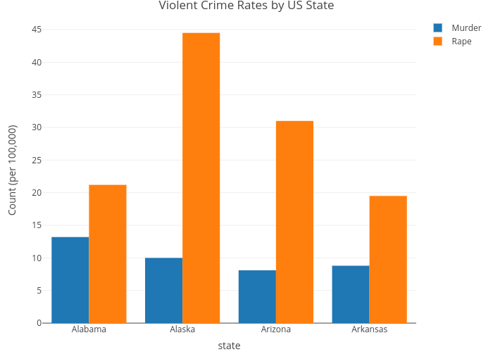
Hover over the chart above and you'll see the respective x and y coordinates for each bar chart, along with its legend name. For this blog post, I used the Violent Crime Rates by US State dataset (Link: https://stat.ethz.ch/R-manual/R-devel/library/datasets/html/USArrests.html) First, if you haven't already, create a free plotly account (Link: https://plot.ly/r/getting-started/) You'll need one if you want to share your data visualization with others or embed it on your site. I'll provide a brief walkthrough on how I was able to create the plot above. I think the interactiveness of plotly is valuable when I'm looking into specifics of my dataset rather than general trends. r script
Here's the code I wrote to read in the USArrests dataset. Note that you will need to set your plotly username and API key in your R session before running the script. Afterwards, you will be able to find your data visualization in your plotly account, along with its html embed code.
For the purpose of this exercise, I only selected the first 4 states by alphabetical order (Alabama, Alaska, Arizona, Arkansas) and visualized a) Murder Arrests b) Rape Arrests per 100,000. I'll be taking a deep-dive into plotly for the next few weeks. Feel free to share any thoughts or ideas you've come across along the way. ggplot users are also welcome!
Google top introduction to data science books and you'll find posts like "6 Books Every Data Scientist Should Keep Nearby" and "80 Best Data Science Books That Are Worthy Reading." These are great BUT who has time to read 80 Data Science books, or better yet, who wants to give up data coding time for data reading?
In David Robinson's post "Don't teach students the hard way first," David goes over why learning tidyverse first is preferable to learning base R first. To me, it's all about doing data things early from the start, which is why I recommend R for Data Science by Garrett Grolemund & Hadley Wickham (Link) The book is an excellent resource for data manipulation, graphics, and EDA (exploratory data analysis) in the tidyverse; it's the ultimate data science 101 book and jump-starts the R user to the ins and outs of data science. To illustrate why I prefer tidyverse over Base R, here's a simple example using the nba_draft_2015 dataset from the fivethirtyeight library which contains information such as player name, position, and draft year.
The first 6 rows of the data
Base R: Filter
WHAT I DON'T LIKE ABOUT BASE R
tidyverse: Filter
WHAT I LIKE ABOUT tidyverse
Which script do you prefer?
After running both Base R: Filter and tidyverse: Filter R scripts above, you'll find that they're actually producing identical code! The filters both result in data frames with 128 rows of players with a position of Center (C) In summary, I recommend R for Data Science by Garrett Grolemund & Hadley Wickham (Link) because it allows the R user to get started doing data science fast. It is also an added bonus that tidyverse code is readable and easy to understand. Your coworkers will thank you when it is time for code review ☺ Don't be the base r guy |
gABEData Scientist Archives
January 2019
Categories |
 RSS Feed