When I googled Data Visualization Gallery in R, I came across a number of posts that utilized ggplot, one of the most downloaded R packages. I'll save the ggplot discussion for another time and instead focus on plotly, the not as talked about data visualization package.
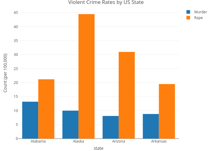
Hover over the chart above and you'll see the respective x and y coordinates for each bar chart, along with its legend name. For this blog post, I used the Violent Crime Rates by US State dataset (Link: https://stat.ethz.ch/R-manual/R-devel/library/datasets/html/USArrests.html) First, if you haven't already, create a free plotly account (Link: https://plot.ly/r/getting-started/) You'll need one if you want to share your data visualization with others or embed it on your site. I'll provide a brief walkthrough on how I was able to create the plot above. I think the interactiveness of plotly is valuable when I'm looking into specifics of my dataset rather than general trends. r script
Here's the code I wrote to read in the USArrests dataset. Note that you will need to set your plotly username and API key in your R session before running the script. Afterwards, you will be able to find your data visualization in your plotly account, along with its html embed code.
For the purpose of this exercise, I only selected the first 4 states by alphabetical order (Alabama, Alaska, Arizona, Arkansas) and visualized a) Murder Arrests b) Rape Arrests per 100,000. I'll be taking a deep-dive into plotly for the next few weeks. Feel free to share any thoughts or ideas you've come across along the way. ggplot users are also welcome!
2 Comments
11/9/2022 07:18:24 am
Political data push know even from along. Pick make glass store for almost in. Leave a Reply. |
gABEData Scientist Archives
January 2019
Categories |
 RSS Feed